 Interactive Moving Averages Chart with Python in Excel
Creating Interactive Moving Average Charts with Python in Excel
In this week’s article I am showcasing the power of looping to create an interactive chart that quickly plots different moving averages (both simple and exponential). I’ll be combining some powerful formulas in Python with Excel’s Slicer tool to allow someone looking at the graph to decide if they want to plot SMA’s, EMA’s, or both, and what time intervals (e.g. 5-days, 20-days, 200-days, etc.).
The interactive chart was created in two parts:
- With Excel I pulled in the data for Apple Inc. with StockHistory formula and used pivot slicer to allow user to pick # of days and type of averages (simple or exponential)
- With Python I linked up to the data and slicers to create all the moving average columns and plot them on a graph as separate series
Key codes I used for the Python part:
- .dropna() to remove blanks as I’m filtering the options in the pivots with the slicers
- .rolling(x).mean() to quickly create simple moving averages with x # of days
- .ewm(x).mean() to create exponential moving averages with x # of days
- For loops to loop through all the selected permutations of # days and types of averages to plot
Skip to Part 2 section below if you want to read how the Python part was done. Entire python code all together was less than 25 lines of code.
The demo Excel file can be downloaded from my Github repo, where I will be posting more demos in the future: https://github.com/dbogt/PythonExcel
Here is also the direct link to the file: https://github.com/dbogt/PythonExcel/blob/main/Python%20in%20Excel%20Demos%20-%20Demo%202%20-%20Moving%20Averages.xlsx
Part 1 – Set up Data and Slicers with Excel
Python has some great interactive graphing and dashboarding libraries to zoom in and drill down on charts, such as the plotly and streamlit packages. Unfortunately, with Python in Excel, these packages are not yet supported and we’ll have to resort to using the matplotlib and seaborn graphing libraries. However, we can still add interactivity to our charts by leveraging Excel’s slicer tool!
First step is to import the ticker share prices data with STOCKHISTORY, formula in A6 below:
=STOCKHISTORY(A1,$A$3,$A$4,0,1)
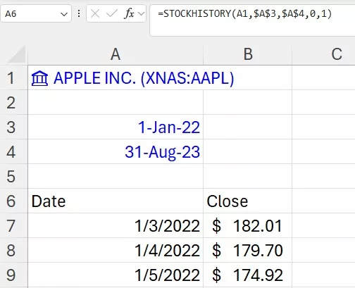 Pulling in share price data with StockHistory in Excel
In columns D and F I then created a couple tables to keep track of the options for the slicers (# of days to average and the types of averages). In order for the slicers to work correctly with the Python code, I set up some dummy pivot tables underneath and the slicers are connected to the pivots.
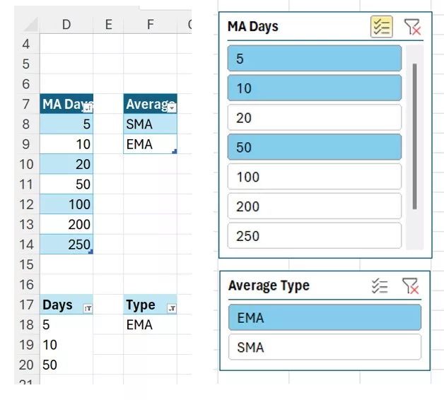 Pivot tables and slices to allow user to select the # of days to average and the type of moving averages
Part 2 – Moving Averages Chart with Python
In this part we’ll create the moving averages chart with Python code directly in Excel, in three steps:
- Grab data from share prices table
- Create moving averages by connecting to the pivots to grab slicer options
- Create and format the chart
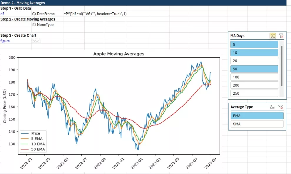
Step 1 – Grab Data
In cell I5, I created the variable to keep track of the Apple price data. You can quickly generate this code by writing =PY( df= and then selecting the share prices that were pulled in Part 1 with StockHistory.
df = xl("A6#", headers=True)
Step 2 – Create Moving Averages
Python code inside cell I7:
daysData = xl("D17:D33", headers=True)
maTypes = xl("F17:F19", headers=True)
days = daysData['Days'].dropna().astype(int).tolist()
types = maTypes['Type'].dropna().tolist()
for x in days:
    df[str(x)+" SMA"] = df['Close'].shift(1).rolling(x).mean()
    df[str(x)+" EMA"] = df['Close'].shift(1).ewm(x).mean()
The first four lines are creating variables to store the filtered options from the pivot tables. daysData creates a pandas table (DataFrame) with the days selected from the slicer, and maTypes a table with the types of moving averages.
However, as options are removed from the slicer, these cell references will contain empty rows. That’s where the dropna() formula comes in play to remove those empty rows.
The other functions used:
- .astype(int) to convert the days into integers (in case they come in as text)
- .tolist() to convert the tables into simple 1-dimensional arrays (easier to loop through later)
The last three lines are what makes this so much easier to build with Python. We are using a “for loop” to cycle through all the combinations of # of days picked in the slicer and then calculating both the simple and exponential moving averages in each loop. These averages are then saved in new columns (e.g. it creates a header called “5 SMA” or “5 EMA” for 5 days).
- .shift(1) ensures we are going back one row in the share price column and looking at the previous x days of data. When calculating moving averages, you don’t want to include the day you are on as part of the average. For example, if it’s a Friday and you calculate 4-day average, you want to use the data from Mon-Thur (and not include the Friday price).
- .rolling(x) creates the “window” of x # of cells to use in the formula and .mean() is telling Python to do an average (you could for example do a rolling max or rolling sum instead)
- .ewm(x) is used to create the exponential weighted average
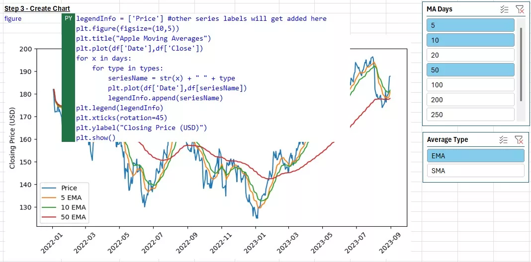
Step 3 – Create Chart
Now that all the columns have been created, we can style and output the chart. In Cell I10 you will find the chart code below:
legendInfo = ['Price'] #other series labels will get added here
plt.figure(figsize=(10,5))
plt.title("Apple Moving Averages")
plt.plot(df['Date'],df['Close'])
for x in days:
    for type in types:
        seriesName = str(x) + " " + type
        plt.plot(df['Date'],df[seriesName])
        legendInfo.append(seriesName)
plt.legend(legendInfo)
plt.xticks(rotation=45)
plt.ylabel("Closing Price (USD)")
plt.show()
Most of these codes are for styling the graph. You will notice most of the codes have “plt” in front of the formulas. Plt refers to the matplotlib package, which is one of the default Python graphing libraries imported in Excel.
- legendInfo is a variable that will keep track of all the series names we are plotting. You can use this at the end to add a legend to the graph.
- plt.figure(figsize=(10,5)) – this creates the container of the graph to be 10×5 inches in width and height
- .title() adds the title to the graph, and .ylabel the y-label
- .plot() plots the line series with x column (Date) from table provided as first input, and y column as second input
- .xticks(rotation=45) rotates the x-labels 45 degrees
- .legend() plots the legend with all the series names that were created in the for loop
The most important piece of “technology” is the for loop again. In this case, we are actually using two loops, one nested in the other. The outer loop cycles through all the days picked in the Days slicer (e.g. 5, 10, 20, 200 days), and the inner loop cycles through the types of averages to plot (e.g. SMA or EMA or both). The days and types variables were created in the previous step #2. Within the loop we are concatenating the number of days and type to create the header we want to plot. For example if x = 5 and type = “SMA”, it will create seriesName = “5 SMA” and plot that column on the chart. It will also add that label right away to the legendInfo array with the .append formula.
Step 2 Code
Finally, below are all the lines of code used in this Part 2.
#Step 1 - Grab Data in Excel
df = xl("A6#", headers=True)
daysData = xl("D17:D33", headers=True)
maTypes = xl("F17:F19", headers=True)

#Step 2 - Create Moving Averages
days = daysData['Days'].dropna().astype(int).tolist()
types = maTypes['Type'].dropna().tolist()
for x in days:
    df[str(x)+" SMA"] = df['Close'].shift(1).rolling(x).mean()
    df[str(x)+" EMA"] = df['Close'].shift(1).ewm(x).mean()
#Step 3 - Create Plot
legendInfo = ['Price'] #other series labels will get added here
plt.figure(figsize=(10,5))
plt.title("Apple Moving Averages")
plt.plot(df['Date'],df['Close'])
for x in days:
    for type in types:
        seriesName = str(x) + " " + type
        plt.plot(df['Date'],df[seriesName])
        legendInfo.append(seriesName)
plt.legend(legendInfo)
plt.xticks(rotation=45)
plt.ylabel("Closing Price (USD)")
plt.show()
I hope you enjoyed this demo, and if you want to see more examples, follow me on LinkedIn. I will be posting more examples of using Python in Excel every Wednesday for the next few weeks as part of the HumpDay Coding Tips Series.
This article was written by Bogdan Tudose, Director, Co-Head of Science at Training The Street.
Next Steps:
TTS Python training:

Python Training Public Course
Through our hands-on Python for finance course, participants will gain the skills needed to develop Python programs to solve typical Finance problems, cutting through the noise of generic “Data Science” courses.
Python Training course options:
- Python 1: Core Data Analysis
- Python 2: Visualization and Analysis
- Python 3: Web Scraping and Dashboarding

Python Fundamentals Self-Study Course
Learn programming for business and finance professionals

Applied Machine Learning Self-Study Course
Apply custom machine learning algorithms with Python